NOTICE: TopEx is no longer maintained and the website at topex.cctr.vcu.edu may be decommissioned in the near future.
TopEx Tutorial: Exploring COVID-19 Tweets
Detailed usage instructions can be found in the TopEx User’s Manual.
This tutorial uses a random sample of public Tweets about COVID-19 from March-December 2020 to identify shifts in topics over the course of the pandemic. Upon completion of this tutorial you will be able to:
- Import data via a set of text files.
- Set clustering parameters, run an analysis, and re-cluster data as needed.
- Use a stopwords file.
- Use an expansion corpus.
- Identify main topic shifts in COVID-19 Tweets between months.
- Download results.
Table of Contents
- Input Files
- Starting TopEx
- Loading Data
- Clustering Sentences
- Navigating TopEx Results
- Re-Clustering
- Using Stopwords
- Topic Comparisons Between Months
- Downloading Data
- Parameter Exploration
Table of contents generated with markdown-toc
Input Files
A sample of Tweets from March and December 2020 are provided as a zip file in the TopExApp GitHub repository under the tutorial_data folder. Before starting the tutorial, download and unzip the Tweets to a folder of your choice on your local machine. Be sure you can navigate to this folder.
Starting TopEx
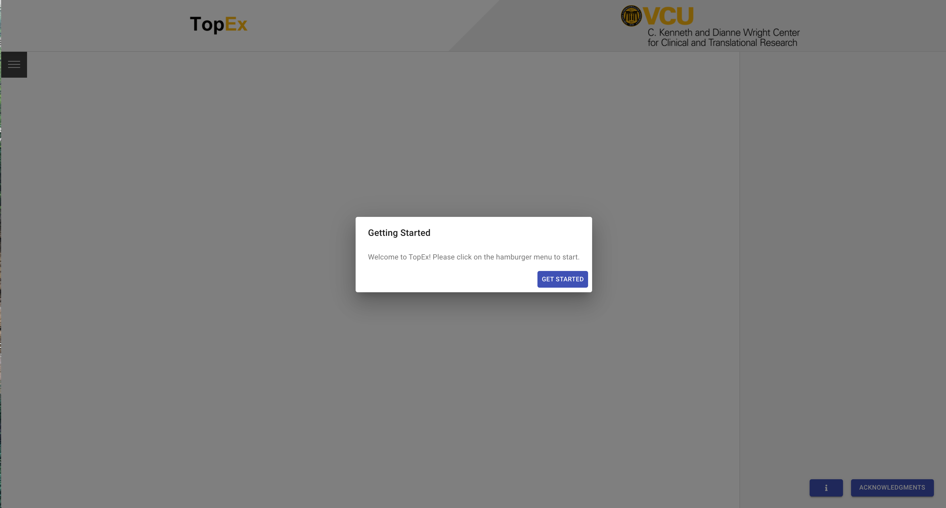
Go to topex.cctr.vcu.edu to start TopEx. You may open TopEx in multiple browser windows as well if you want to run and compare multiple text corpora, such as different months of Tweets.
Once loaded, you should see a window similar to the following:
Loading Data
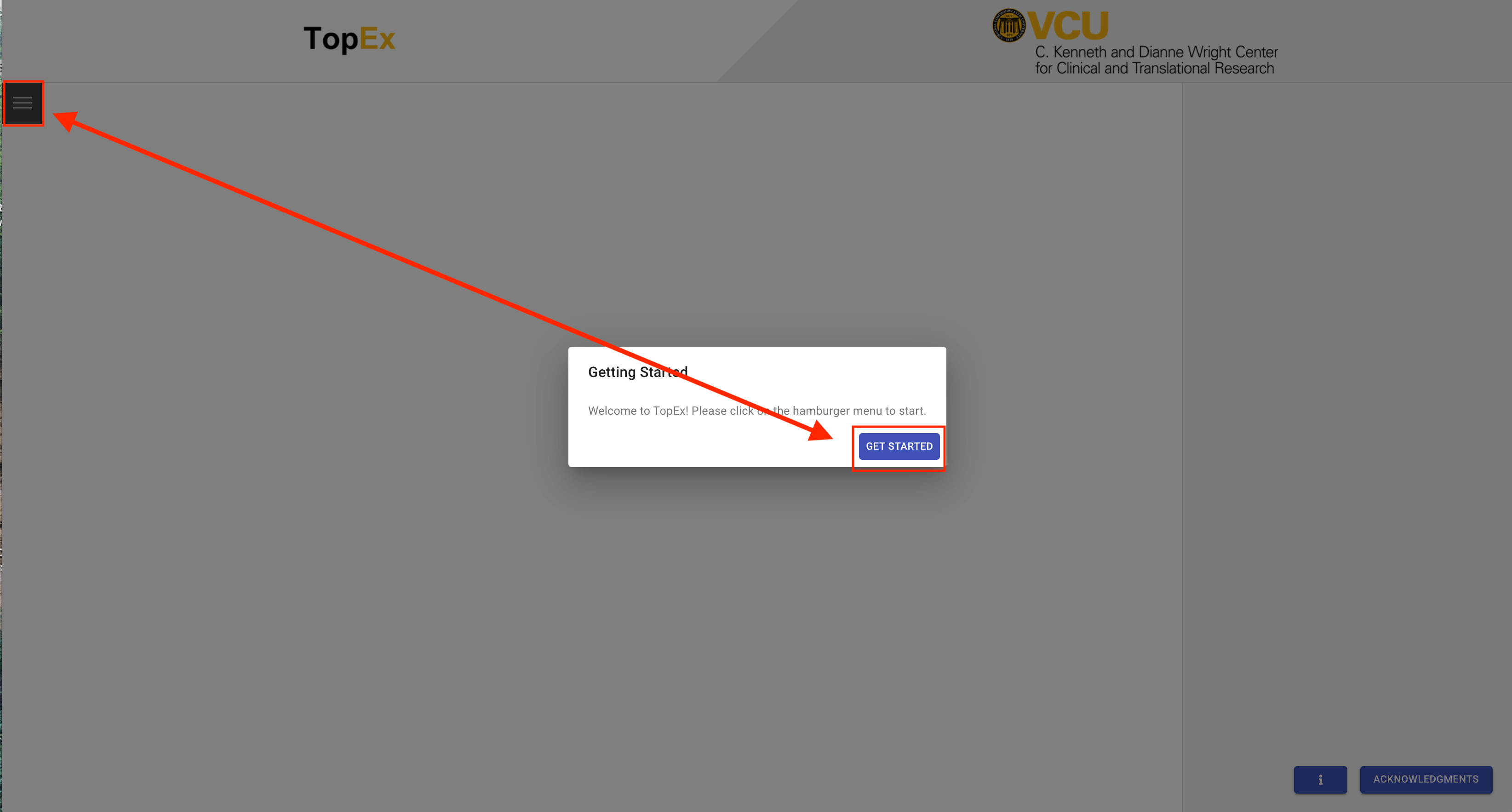
To start uploading data, click on “Get Started”, then click on the hamburger menu in the upper left corner of the TopEx window.
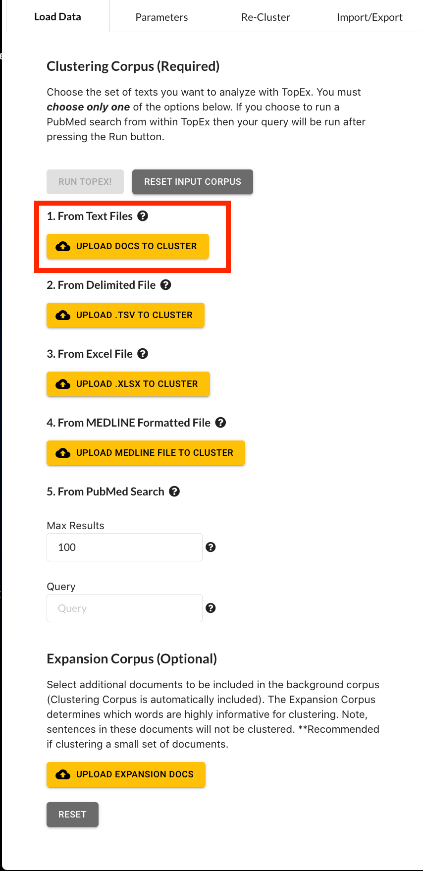
You should see a pop-out menu as shown below.
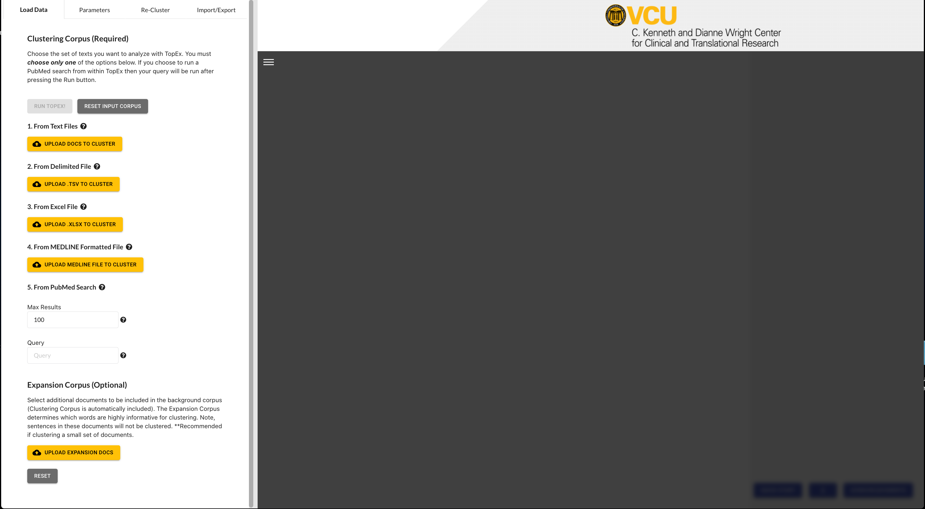
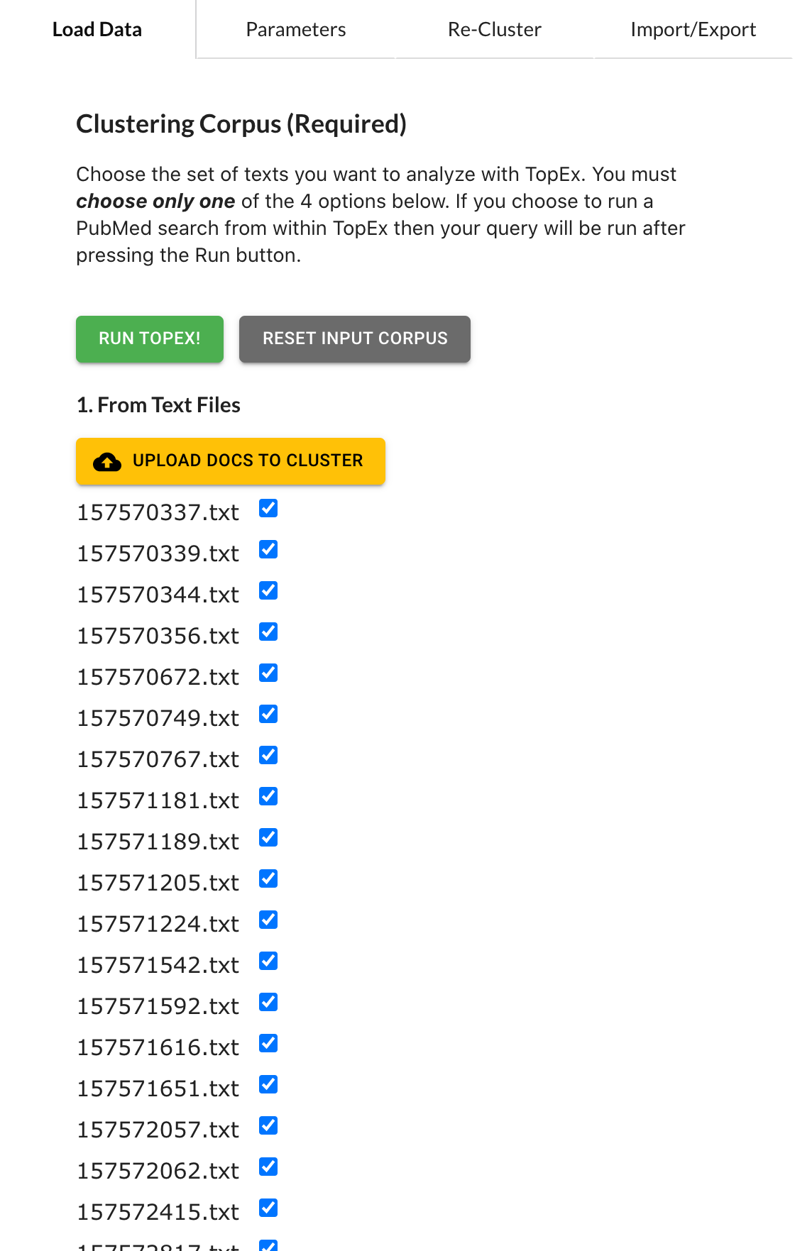
Under the “Documents to Cluster” section click on the “upload docs to cluster” button.
Navigate to the folder containing the March 2020 COVID-19 Tweets.
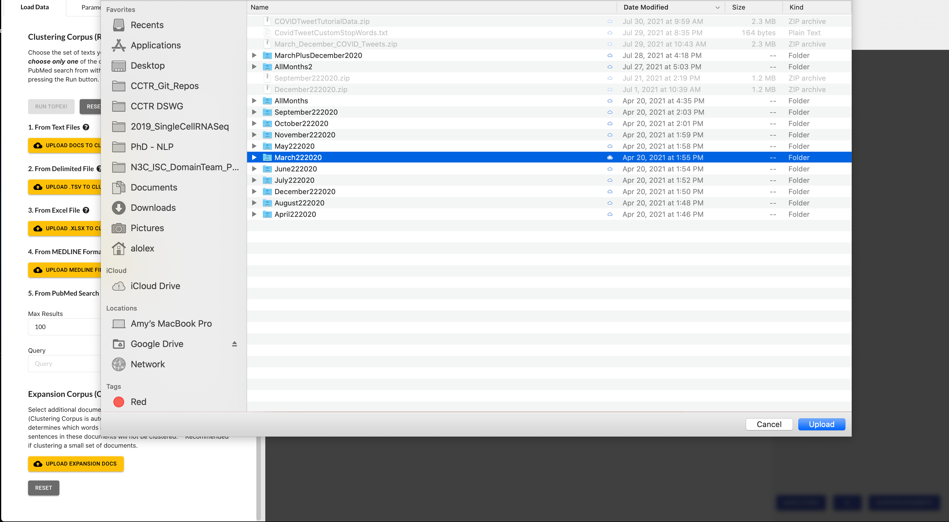
Select the “March 2020” folder, then click “Upload”. It will ask you if you want to upload 1,657 files - select “upload” again to import the data. Once imported you will see the list of files appear in your menu bar.
Clustering Sentences
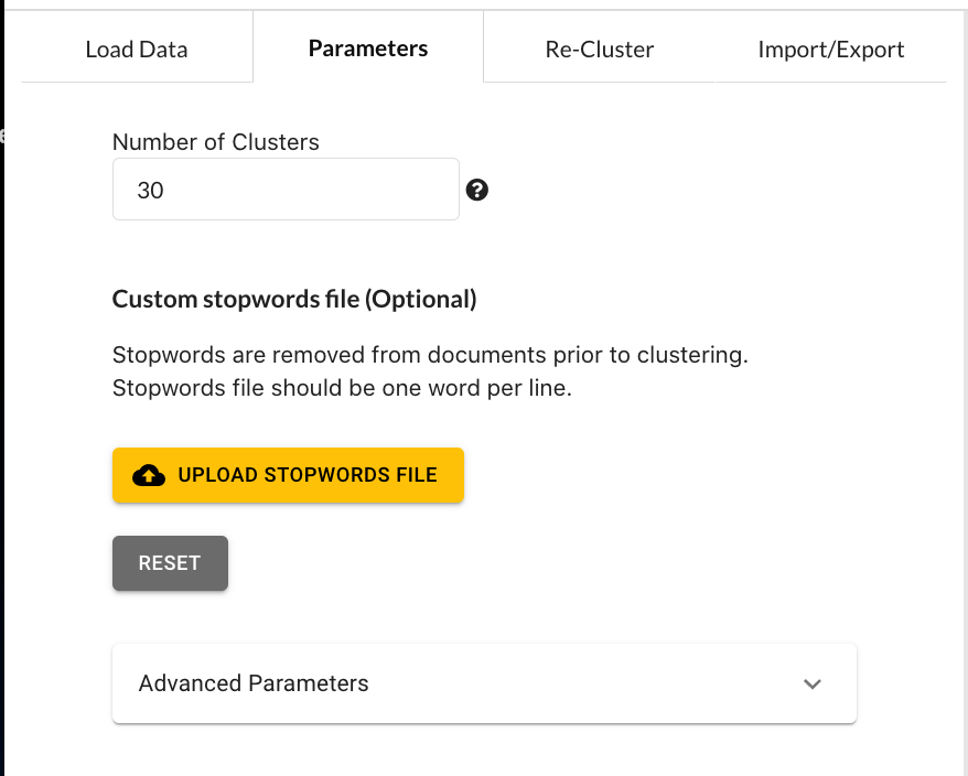
Once your files have been imported, click on the “Parameters” tab in the left side menu bar. This tab provides you many options for tuning the various stages of transforming each sentence into a numerical vector. For a detailed explanation of each option, please read the TopEx User’s Manual. For this tutorial, set the options as shown below:
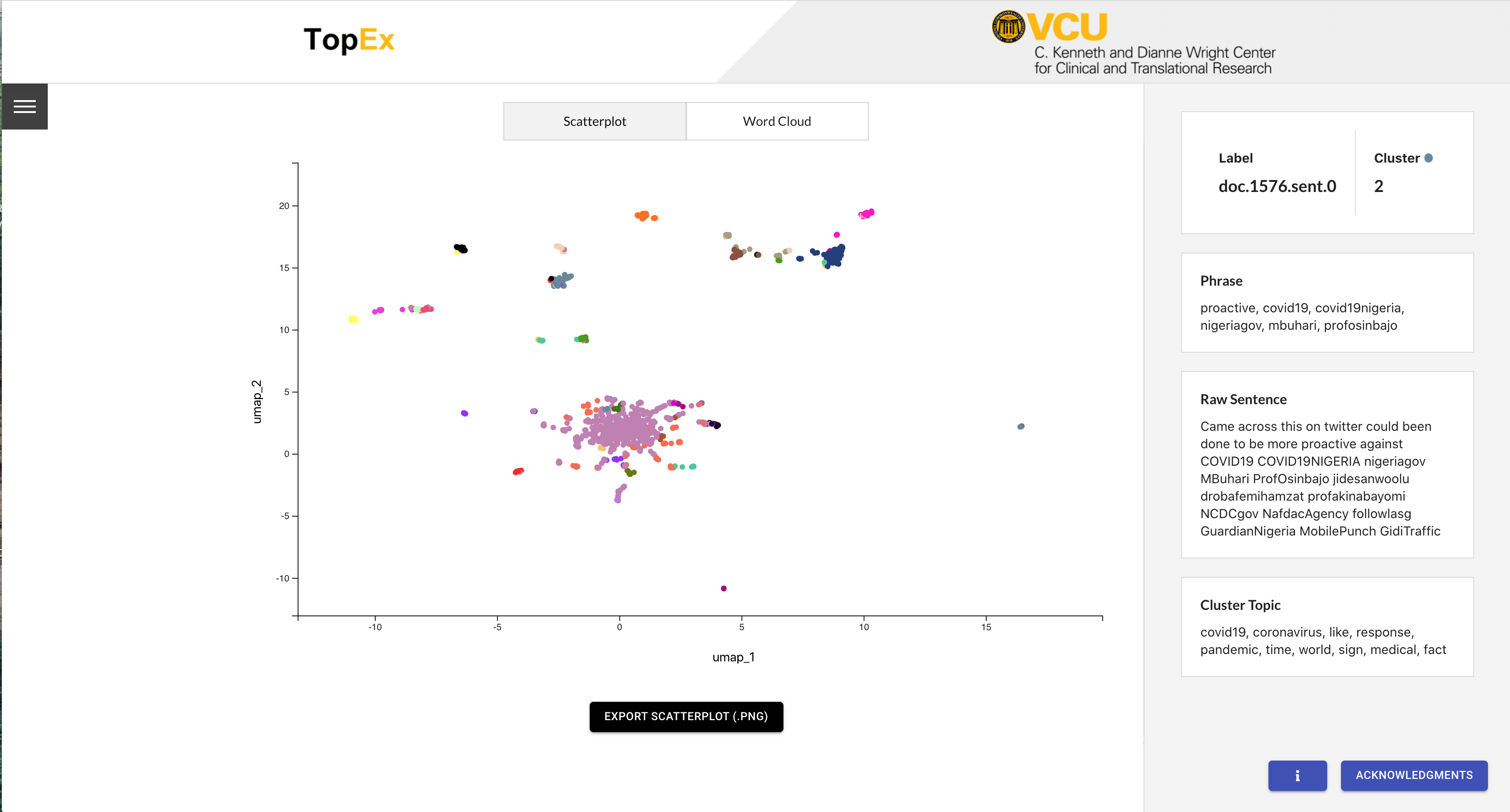
Now navigate back to the “Load Data” tab and click the “Run Topex!” button. When the analysis is complete the scatter plot should pop up and look similar to the following:
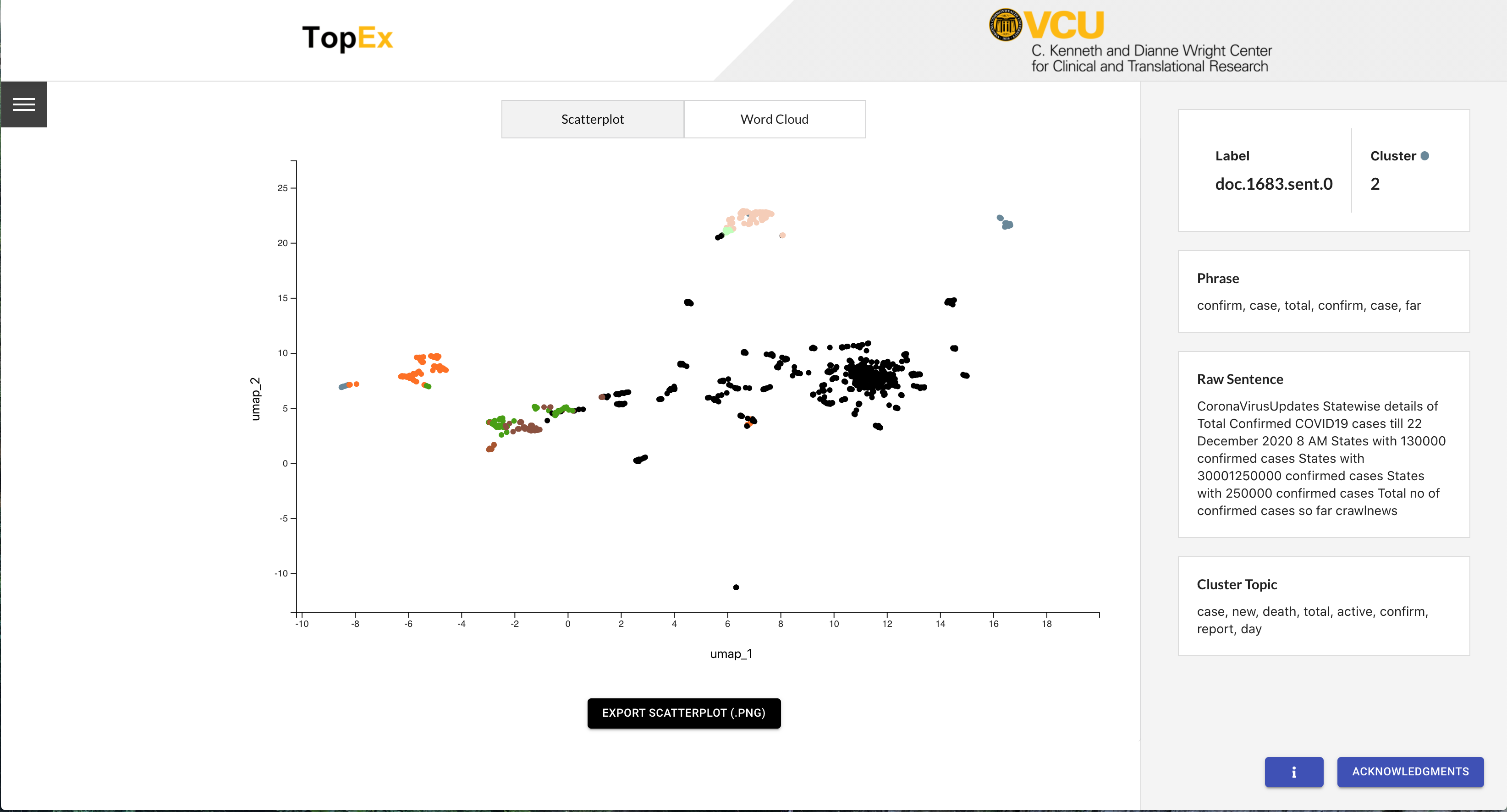
Navigating TopEx Results
TopEx displays results in two ways: an interactive scatter plot and word clouds. The scatter plot is shown by default, however you can switch to the word cloud view using the toggle at the center top of the page.
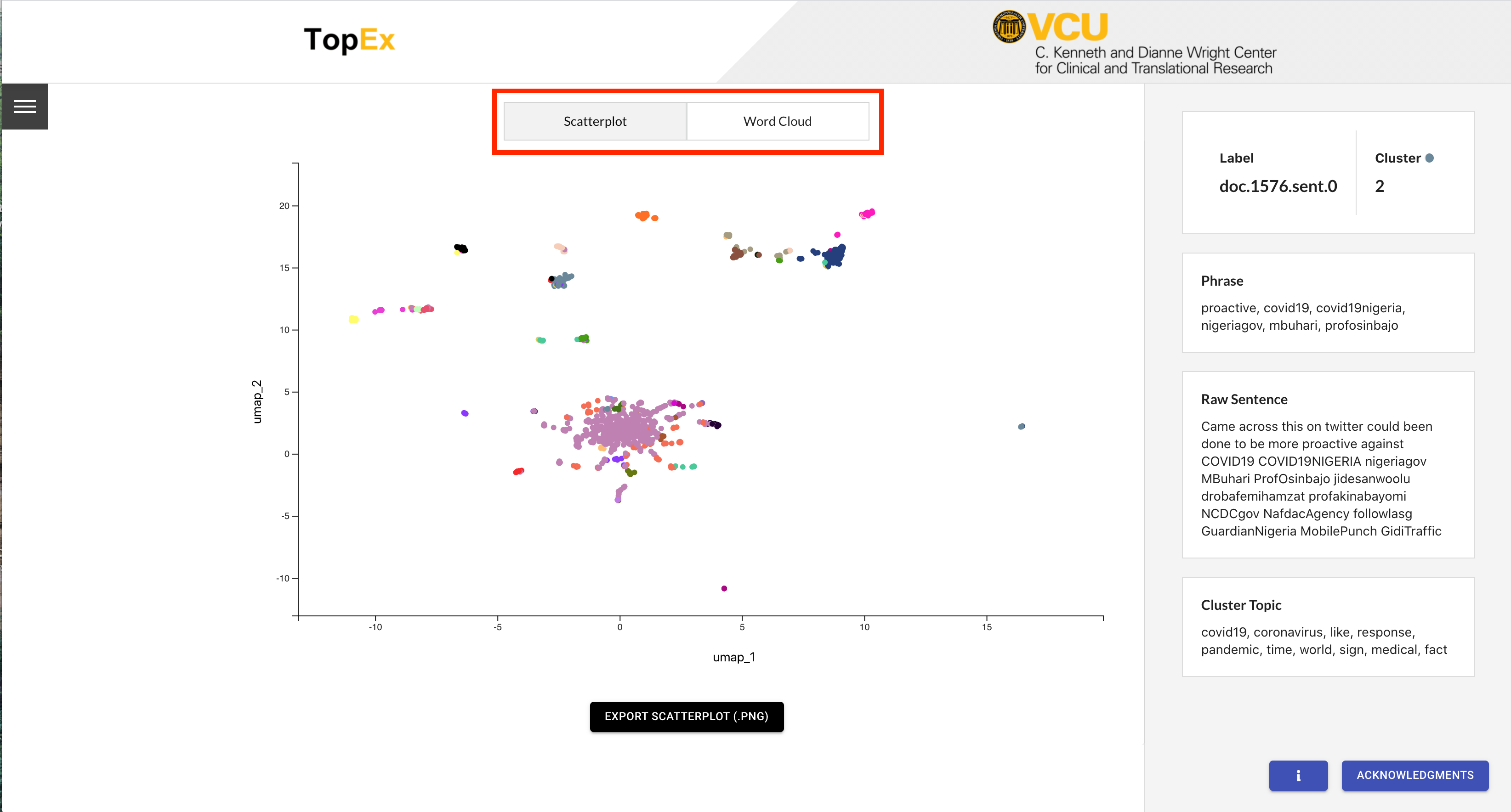
Exploring the scatter plot
In the scatter plot view, each dot represents one sentence from your input. The location of each dot is determined by reducing the distance matrix from the Sentence Clustering step down to 2 dimensions using one of the reduction methods listed under the “Visualization Method” parameter in the Parameters tab (UMAP, tSNE, SVD, or MDS). For this tutorial we chose to use UMAP, which is the default and recommended method. In a UMAP plot, the closer in space two dots are, the more similar they should be. In the scatter plot results for COVID-19 Tweets in March 2020 we can see one large cluster in the center with several smaller clusters farther out. The colors of each dot represent the cluster they are in, which is reflected in the information on the right side panel.
Hovering your mouse over a dot displays the information about that sentence in a panel to the right of the plot. This information includes:
- The document and sentence IDs.
- The cluster ID.
- The phrase used by TopEx to numerically represent this sentence.
- The full original sentence.
- This cluster’s topic with the top N topic words present in the cluster (can be adjusted using the Re-Cluster Tab).
For example, hovering over the orange Cluster 3 at the center top displays the Cluster Topic that includes key words “coronavirus” and “spread”. Looking around there are several distinct groupings of sentences; however, they are not all assigned to the same cluster (i.e. have the same color). This is an indication that we may have too many clusters, or need to change our visualization parameters to reflect the clusters that are present (See Re-Clustering section below).
Word Clouds
Another way to explore the topics present in a set of texts is through the Word Cloud visualization. Click on the “Word Cloud” toggle at the top of the scatter plot. You should see a screen similar to the following:
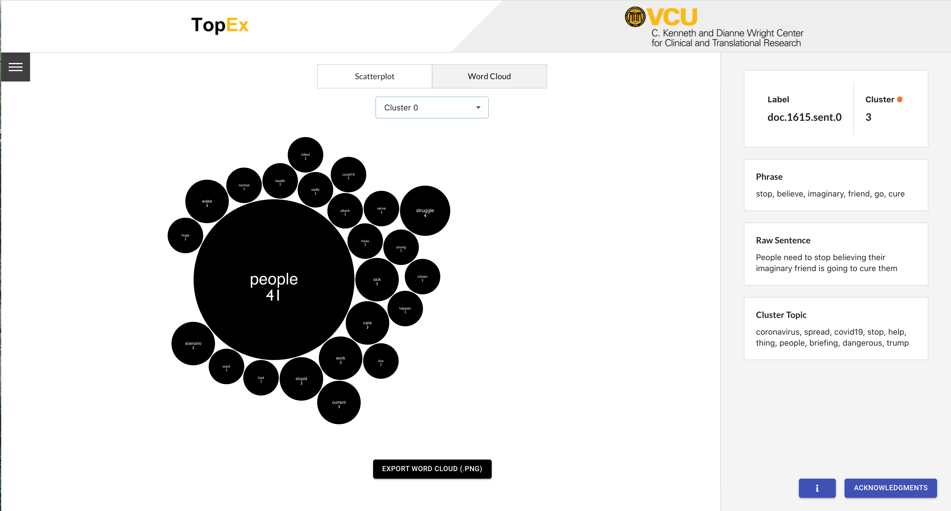
Word Clouds show word frequencies in a set of texts with the largest words being those that are the most frequent. You can toggle between the different clusters using the drop down at the top of the page. Scanning through all the clusters you can get a general idea of what each is about just by looking at the most frequent words in each Word Cloud.
Re-Clustering
In the current results there are too many clusters as some of our breakout groups of sentences are assigned to different clusters. Ideally we would like to see these breakout groups in the scatter plot all be placed in the same cluster (like orange cluster 3), so lets go to the “Re-Cluster” tab and group sentences into fewer clusters.
The Re-Cluster tab allows you to re-group sentences into a different number of clusters, and re-run the topic analysis for each cluster without having to re-run the costly NLP analysis. Once on the Re-Cluster tab, enter in the values as shown below.
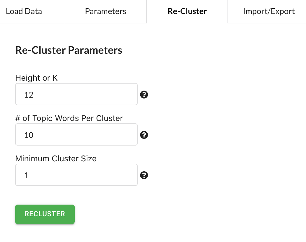
The first option “Height or K” allows you to choose the number of clusters you want (K) the data grouped into if using K-means, or the height of the dendrogram if using Hierarchical clustering (Height). For Hierarchical clustering, smaller numbers will result in MORE clusters and larger numbers will result in FEWER clusters, while for K-means the number you enter is the number of clusters that will be returned.
The second option determines the number of keywords to display for the cluster topic. The default is 10, so we will use that, however, if you want more or fewer that can be adjusted here.
The third option aids in cleaning up the scatter plot to remove clusters that only contain a few sentences. For example, if set to 10 then only clusters with at least 10 sentences will be displayed. For this tutorial we will set it at 1, which includes all clusters.
Once the new parameters are set you can press the Re-Cluster button and your scatter plot and word clouds will be updated momentarily. You should get a scatter plot that looks something like the following:
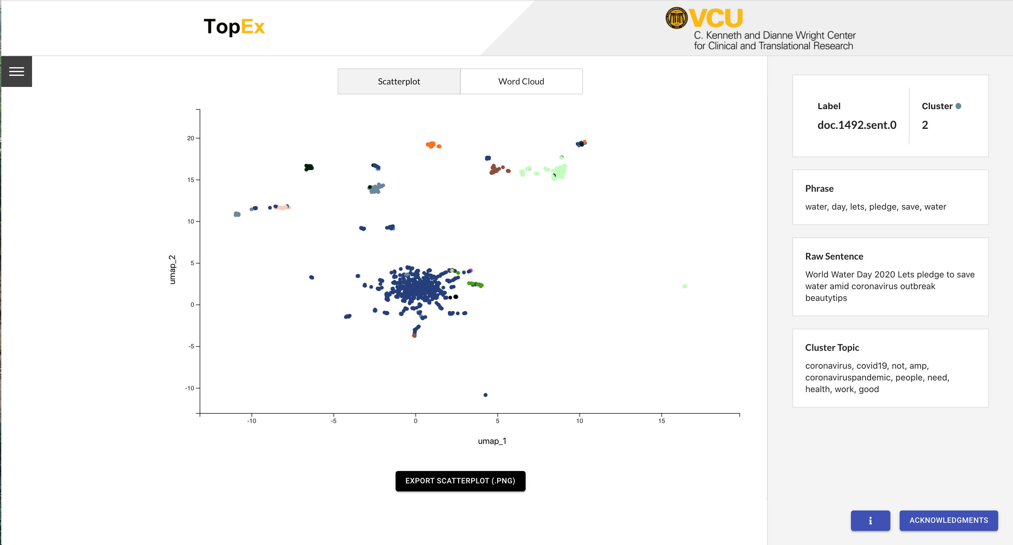
Notice that now many of the sentence groupings that were assigned to multiple clusters are now assigned to a single cluster and the plot looks much cleaner!
Using Stopwords
While re-clustering helped a bit, there are still some issues with the current analysis. Using the Word Cloud visualization, we can see that many of the clusters are dominated by uninformative words, including “coronavirus” in Cluster 7, “covid19” in Cluster 2, and “people” in Cluster 11.
These terms are uninformative because the Tweets were selected specifically because they were in response to the pandemic. Thus, having clusters of sentences dominated by these terms is not helpful in this situation.
Stopwords are words that are uninfomrative for a particular analysis and are removed from an analysis. TopEx by default removes a host of standard stopwords such as “the” or “and”, however, there are generally domain-specific stopwords, such as “covid19”, that also need to be removed. Thus, we need to create and upload a custom stopwords file for this analysis so that TopEx will ignore terms like “coronavirus” during it’s analysis.
A Stopword file is simply a text file with one term per line. As TopEx does not yet have concept mapping, you will need to enter in all variations of a term in order for it to be removed. For example, the file should contain both “COVID-19” and “COVID19”. For this tutorial we have already created a stopwords file named “CovidTweetCustomStopWords.txt” located in the tutorial_data folder on the GitHub page. Navigate back to the Parameters tab, and scroll down to the “Custom stopwords file” section. Click on the “Upload stopwords file” button, then navigate to the file and select it. A successful upload will results in the file name appearing below the “Reset” button.
If uploading a stopwords file, then the NLP algorithm has to be run again. Navigate to the “Load Data” tab and click the “RunTopEx!” button. You should get a scatter plot that looks like the following, which is different from the first one.
Note that with the first scatter plot 30 clusters looked like too many, however, 30 clusters for this plot looks ok. They are small, but reading through the Word Clouds finds a few that are informative. For example, Cluster 7 is all about helping to stop the spread of the virus. Cluster 1 is about new case confirmations while the closely related Cluster 5 focuses more on the death toll and Cluster 21 is about testing positive. Continue to explore the other clusters to see what else you can identify. Also, remember that there are no “correct” number of clusters here. Feel free to play with the reclustering and the NLP parameters to see how that affects your results!
Topic Comparisons Between Months
Now that we have our March Tweets analyzed we need to run the same analysis for December. Open up a new TopEx instance in your browser, and run the same analysis with the similar settings on the December Tweets, and change the number of clusters to 8 this time. You should end up with a scatter plot with 8 clusters:
Notice the number of clusters is reduced from 15 to 8. This is because in December there were fewer main focal points of discussion. Explore the data and try to identify which cluster of Tweets discuss the following:
- New cases/death toll
- Vaccinations
- New UK variant
- Covid-19 Stimulus Bill
In comparing these topics to those from March it is easy to quickly identify how the main topics have shifted over the course of the pandemic.
Downloading Data
Now that we have analyzed our Tweets we will want to save this data for future analysis. TopEx has multiple ways to export data on the Import/Export tab that are described below:
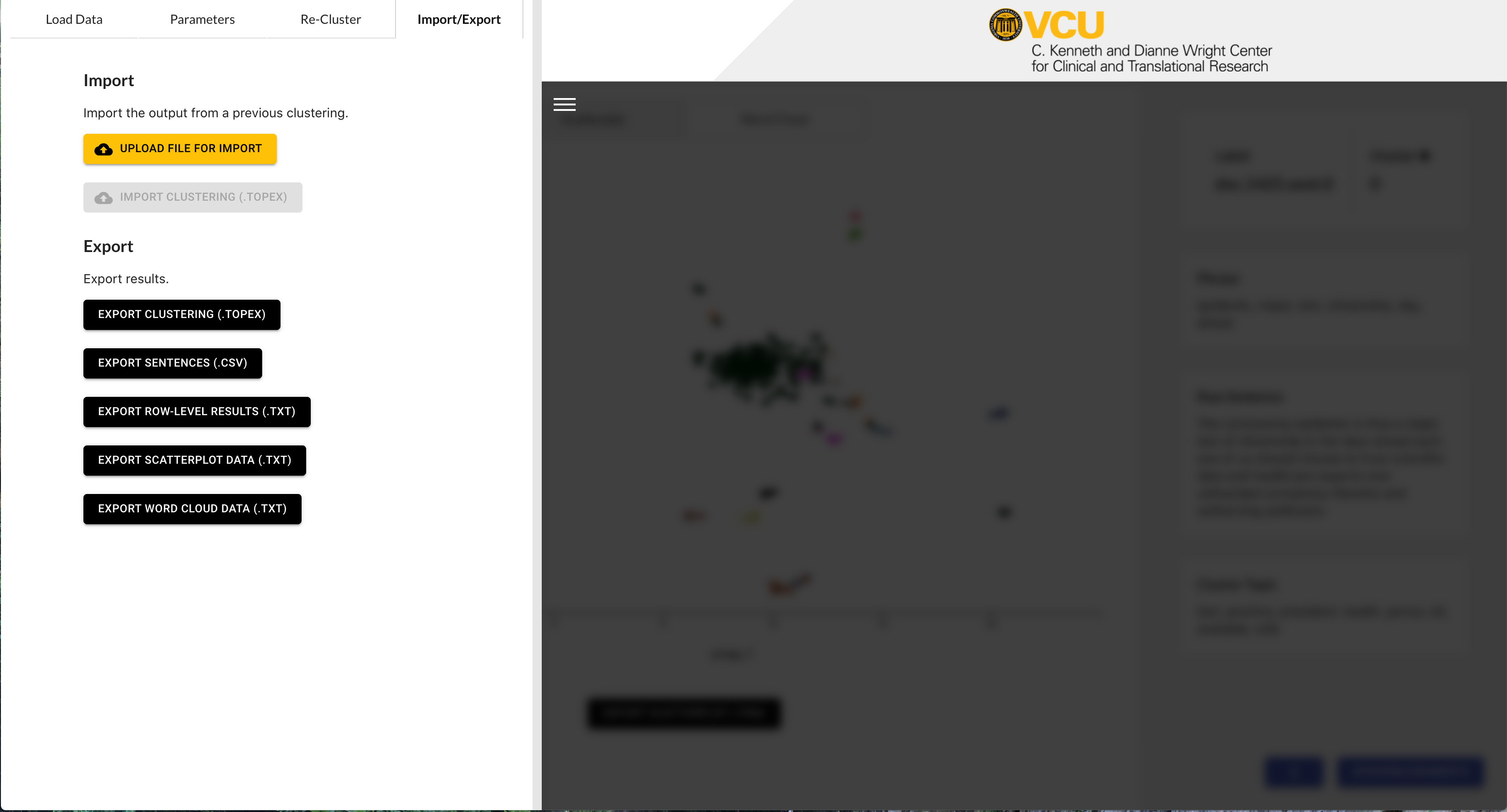
- Export Clustering (.topex): The .topex file allows you to export the current TopEx settings and data view. You can export then import this file back into TopEx at a later data and have re-clustering functionality as well as data export capabilities.
- Export Sentences (.tsv): This option just exports a list of all the sentences that were analyzed.
- Export Row-Level Results (.txt): This is the most useful file for further analysis of TopEx results. This option downloads a pipe-delimited text file that can be uploaded into programs like Excel. Data includes the raw text, assigned cluster, chosen phrase, topic key words for each sentence that was processed, and document name. Sentence clusters can be analyzed in detail using this output option.
- Export Scatterplot Data (.txt): This option exports a delimited text file with the coordinates and cluster assignment for each sentence so you can re-create the scatterplot in external tools like R for publications.
- Export Word Cloud Data (.txt): This is similar to the scatterplot file where the raw word frequencies are saved in a delimited file so that word clouds can be generated in external tools for publication.
Finally, on each of the visualization screens you can export a low resolution snapshot of the scatterplot or word clouds for documentation purposes.
Parameter Exploration
This tutorial didn’t explore all the parameters that you have the ability to change. For example, the “Window Size” parameter affects the sentence representations by using more or fewer words to represent a sentence. As Tweets are generally shorter that normal sentences you could try to adjust this parameter down to get more Tweets in your analysis (TopEx ignores sentences that are too short to meet the minimum phrase length). Now that you have a general understanding of how TopEx works, play with some of these parameters to see if they are helpful in analyzing these Tweets.